A rebranding of a global leader in sustainable development finance to stand apart in a crowded space.
Client:
Italist
Context:
Intern-led rebrand during a 4-month internship at Dossier Creative.
Project Scope:
Complete brand repositioning including research, brand identity, renaming, visual identity design, and a website concept.
Live Website with Rebrand:
Left: Old Logo (IFCL).
Right: New logo (Momentus).
When we started working with the client, they were known as IFCL - International Financial Consulting LTD. With over 20 years of experience supporting governments and development finance institutions globally, this woman owned and led company had a strong track record of their impact across the globe.
But their brand didn’t reflect that. The name and visual identity felt generic and corporate. They needed a name and brand system that not only communicated the real-world impact of their work, but also helped them stand apart in blended landscape.
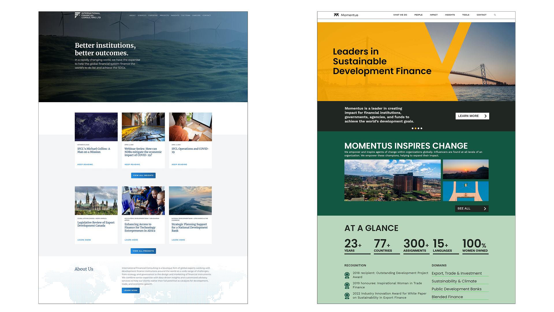
Left: The IFCL home page before rebrand.
Right: The rebranded home page exemplifies the passion and determination Momentus carries through their projects and showcases the impact Momentus has with their clients.
We kicked off with a strategic discovery phase, working closely with Momentus’ founder and leadership team to define their brand’s purpose, and to surface brand values such as global insight, action-orientation, and deep relationships. These values stayed central to the brand strategy and are reflected throughout the final identity.
To better understand their audiences, we created stakeholder personas based on internal insights and external research. Given the technical nature of their work, we focused on making complex ideas more approachable and extracted key messages to build shared understanding.
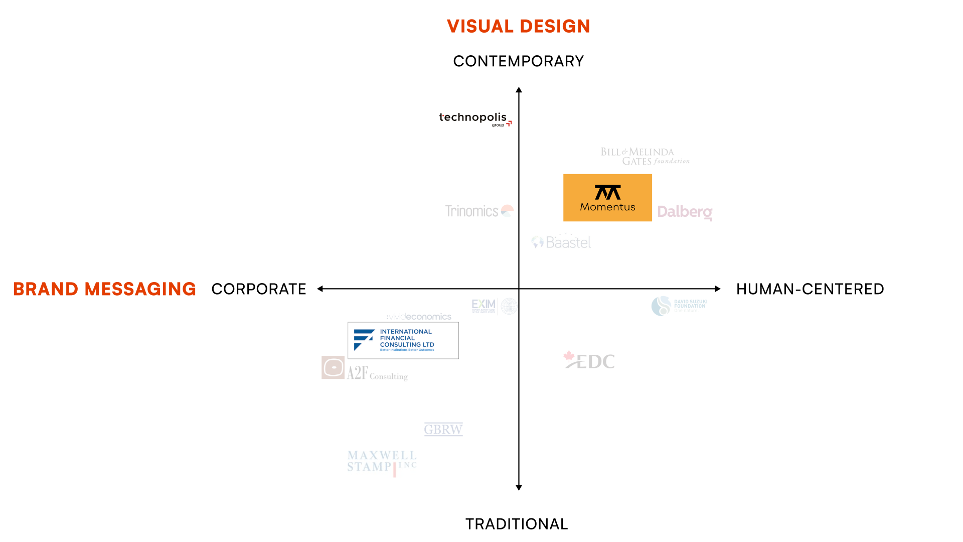
A competitive landscape matrix which captures our client's competitive space and illustrates where IFCL was prior to the rebrand in the bottom left quadrant, before achieving their target repositioning as Momentus in the upper right quadrant as more contemporary with their visual design and human centered with their tone and messaging.
We also conducted a brand landscape audit of competitors in the sustainable finance space. This revealed a pattern of corporate messaging and indistinct visual identities, reinforcing the need for Momentus to stand out with a human, contemporary, and clearly differentiated brand.
These insights informed the foundation of a new brand strategy that guided our design decisions — one centered on their ability to get things done while building and nurturing strong relationships. The strategy was designed to reflect their credibility while opening the door to a more approachable tone with clearer storytelling.
During an early brand strategy sessions, the idea of a concise, one-word name came up — something bold, easy to remember, and globally friendly. We explored several directions, but Momentus stood out. It combines “momentum” — a nod to the client’s drive to move things forward — with “momentous,” suggesting meaningful, lasting impact.
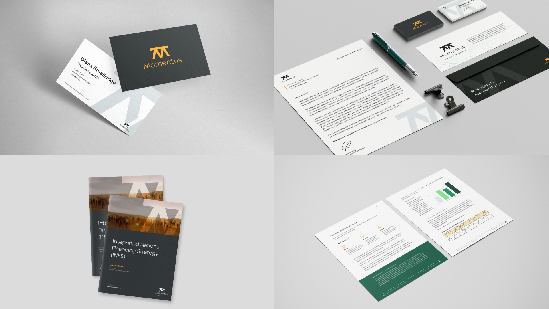
From there, we developed a full brand identity system that reflects who they are: confident, human, and driven by clarity. The design system includes a refined logo, strong typography, and a colour palette that balances trust and energy. We explored layout directions for digital and print touchpoints to ensure consistency without being rigid.
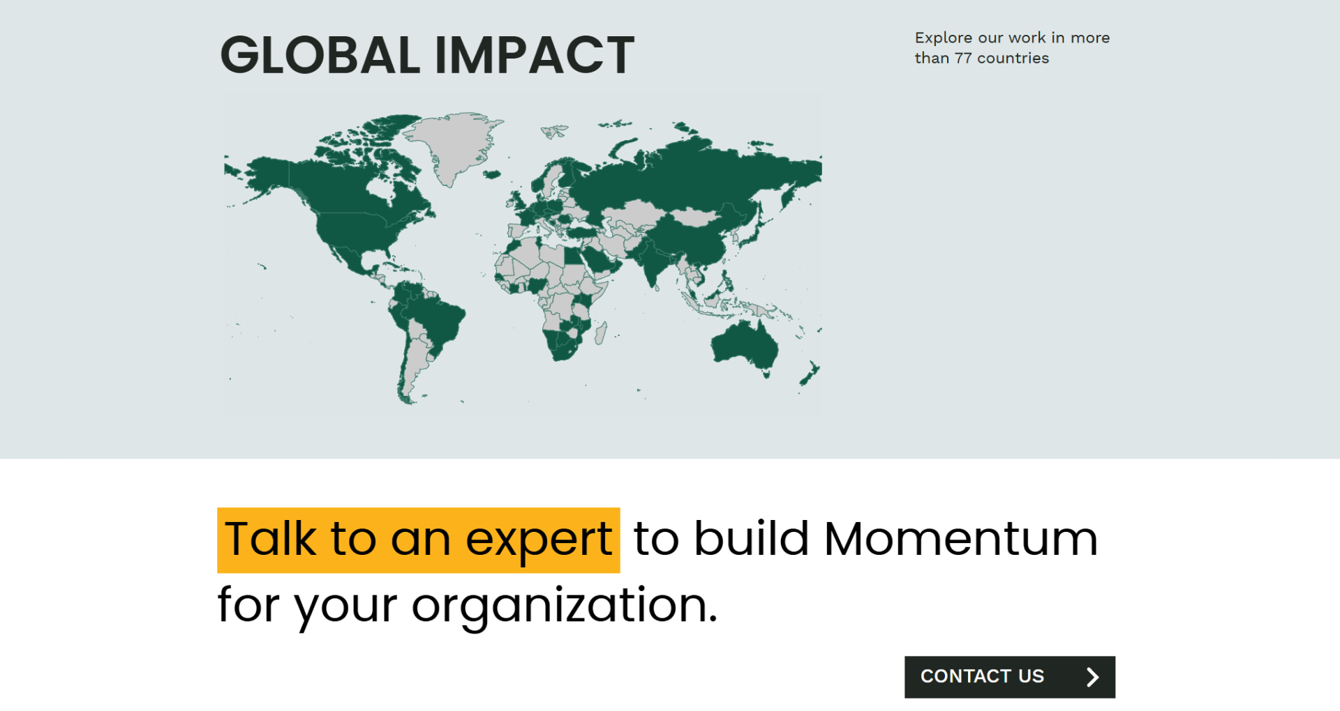
A section on the homepage of Momentus’ website, illustrating the scale of their global impact in a bold manner, with a clear call to action to start a connection.
Colour palette and colour variations of logo.
Visually, the identity system was designed to reflect their confidence and their ability to bring simplicity to financially complex projects — emphasizing how Momentus connects the right people and resources to move things forward.
My lead roles were visual and logo design for the team. The redesigned logo is recognizable, scalable, and reflects the structure and stability of working with Momentus through a clear, memorable icon. The colour palette balances trust and energy, with orange chosen for its warmth and confidence, and greens reinforcing credibility and the impact of their work on the ground. The secondary palette was created for everyday use, giving non-designers the flexibility to create materials that still feel cohesive and on-brand.
Momentus launched with a new name, strategy, and identity system that better reflects their work and their impact. The rebrand helped align the team internally, while also giving them the tools to confidently communicate their story to partners, funders, and global institutions.
The new identity supports their shift from a consultancy with strong capabilities to a brand with a bold presence — positioned to connect with stakeholders, secure partnerships, and grow their impact globally.
This project reminded me how much power there is in listening. By creating space for dialogue, asking the right questions, and working alongside the client, we arrived at a brand that felt both strategic and true to who they are.
One of the biggest things I took away was learning how to collaborate more effectively with clients. I learned when to lean in — whether to clarify a design decision, push back gently with rationale, or help guide conversations with structure. I also learned when to lean back and let the client’s own words or instincts shape the work.
It’s a balance — but finding it made the process smoother, more collaborative, and ultimately led to stronger outcomes.
I deepened my experience in naming, design systems, and brand storytelling — and gained a clearer understanding of how to build flexible identities that scale. From research to rollout, this project taught me that every detail counts when it comes to building a brand people can believe in.